Typography
Inter
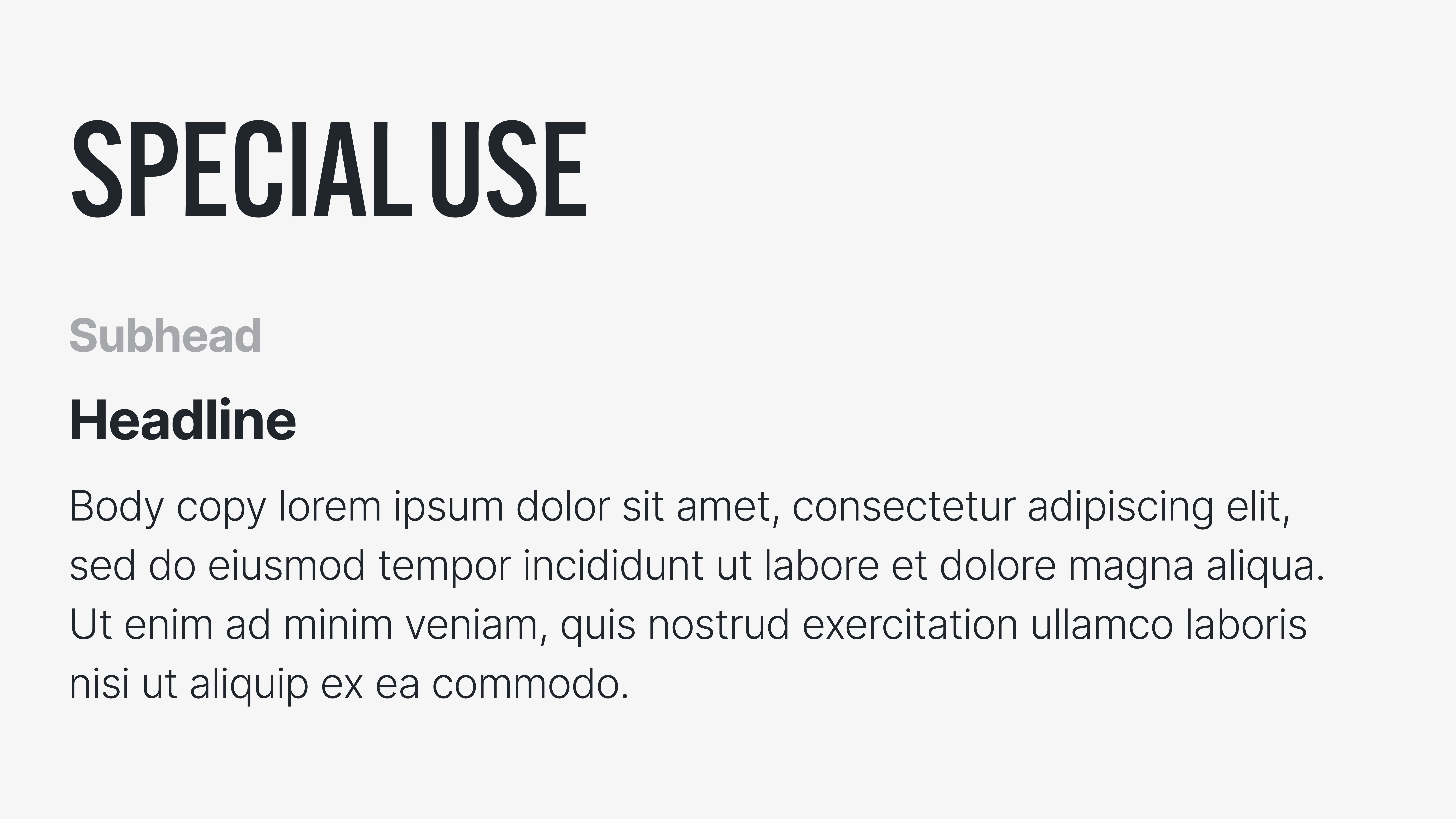
Inter has been selected as The Arts Commission’s primary typface and can be used for both body copy and headlines and subheads. Inter is available for free from Google Fonts.
About
Inter is a variable font family carefully crafted & designed for computer screens. Inter features a tall x-height to aid in readability of mixed-case and lower-case text. Several OpenType features are provided as well, like contextual alternates that adjusts punctuation depending on the shape of surrounding glyphs, slashed zero for when you need to disambiguate "0" from "o", tabular numbers, etc.
The Inter project is led by Rasmus Andersson, a Swedish maker–of–software living in San Francisco.

ATF Alternate Gothic
Alternate Gothic is the typeface used in The Arts Commission’s logotype and lockup. This typeface can be used as headlines and subheads where applicable. Alternate Gothic should always be set in uppercase for consistency with the brand.
About
The metal typefaces originally produced by the American Type Founders Company are well known and well loved. From the familiar sans serif letterforms seen virtually everywhere to thoughtful revivals of historic text faces, ATF’s type designs have inspired countless fonts by other foundries.
The American Type Founders Collection builds on the ATF legacy of originality, creativity, and innovation, introducing new digital interpretations of classic ATF typefaces. Fonts in the ATF Collection are developed with the needs of contemporary type users in mind. Attention to aesthetics and usability are paramount—ATF font families build on their predecessors, offering more weights and widths, and the robustly expanded character sets and typographic features made possible with digital font technology. The ATF Collection brings the same visual richness to page and screen that handset type once brought to the printed page.

Text Styles
Below is an example of how text should be styled for The Arts Commission brand. You'll notice the Alternate Gothic typography is only to be used in one style, all caps, and in special use cases like a core program or event. Inter should be used for all other type applications, is best used in title case, and styled as it appears below.